One of the most controversial topics among the burnt orange faithful are the uniforms worn by the UT football team. Although Texas has one of the most iconic uniforms in the history of the sport, each year discussions rage regarding the current state of the jersey, as well as the hypothetical addition of an alternate set to the Horn’s repertoire.
Seemingly everyone has an opinion on what the team should (or shouldn’t) wear when they take the field. As such, it should be unsurprising to see that UT’s athletic director, Chris Del Conte, has fielded a wide variety of inquires related to the subject over the past few years. While CDC has inferred that the football team will not wear a true alternate uniform in the near future, he has shown a clear interest in ensuring that the Longhorn’s base set is as good as it can possibly be. One such change under his watch came in 2021, when the color of the Longhorn stickers on UT’s helmets were reverted to the darker shade of orange they had been prior to 2014.
Also in 2021, Del Conte divulged on Twitter that the football team would be receiving new uniforms in 2022. While concrete information regarding them was non-existent, speculation among the fanbase ensued as to what these updated jerseys would look like. Theories as extreme as a darker shade of orange on the jersey or a full-time throwback look were proposed. Alternatively, others felt that these new uniforms would only offer minor changes, such as the removal of various patches/branding on the front of the jersey. While nothing was for certain, the athletic department recently decided to end the speculation by releasing images of UT’s new 2022 uniforms on social media.
Uniform Changes
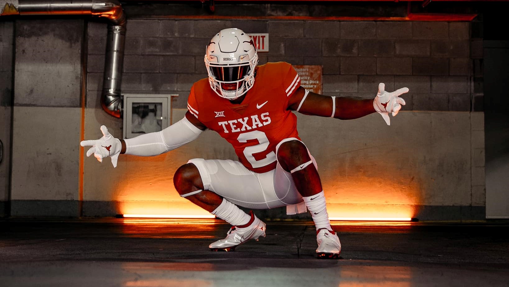
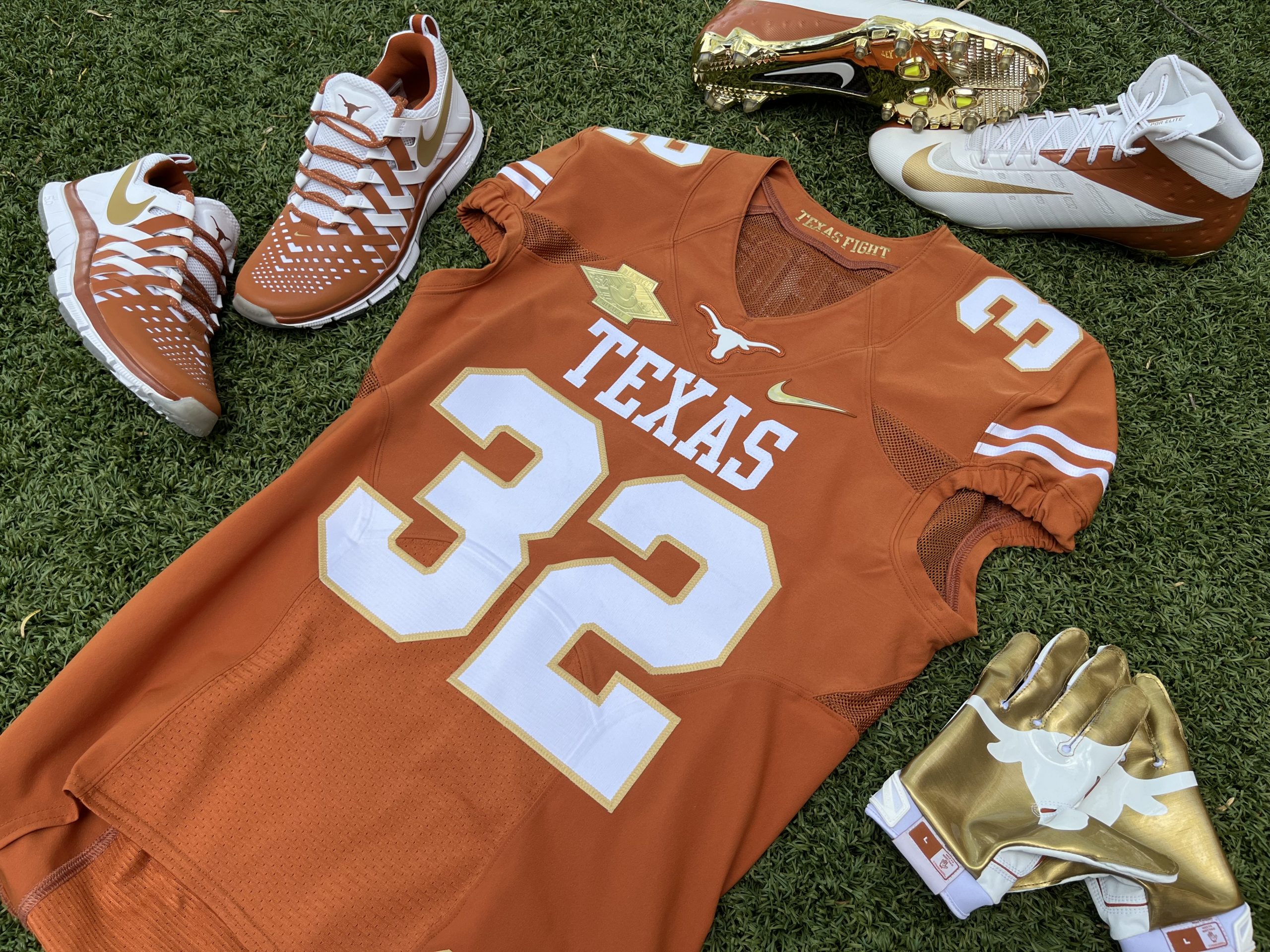
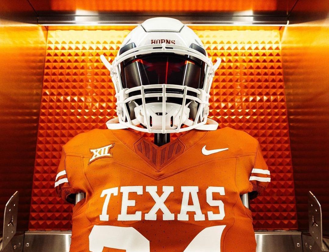
The jersey is home to the most notable changes on Texas’ new uniforms. Here, UT’s 2022 shirts forgo both the Longhorn logo on the collar, as well as the TV numbers on the top of the shoulders. Both of these design features first appeared in 2013, when Texas upgraded to Nike’s Pro Combat Hypercool uniform template. They also seemed to be the two elements that the vast majority of fans wanted to see removed, so it’s a change that has been met with almost unanimous positivity since the reveal.
Texas will be sticking with Nike’s Vapor Untouchable uniform template for their new jerseys. The Longhorns originally began using this chassis at the start of the Tom Herman era (2017), and the team has worn it in each of the previous 5 seasons. While there was some speculation that the Longhorns would be upgrading to Nike’s Vapor Fusion template for their new uniforms, it appears that this will not be the case in 2022. UT and other top programs are well overdue for a uniform upgrade from Nike, and while Oregon has been wearing the Vapor Fusion template since 2019, it appears that the Swoosh has opted to keep it exclusive to their hometown Ducks (at least for the time being).

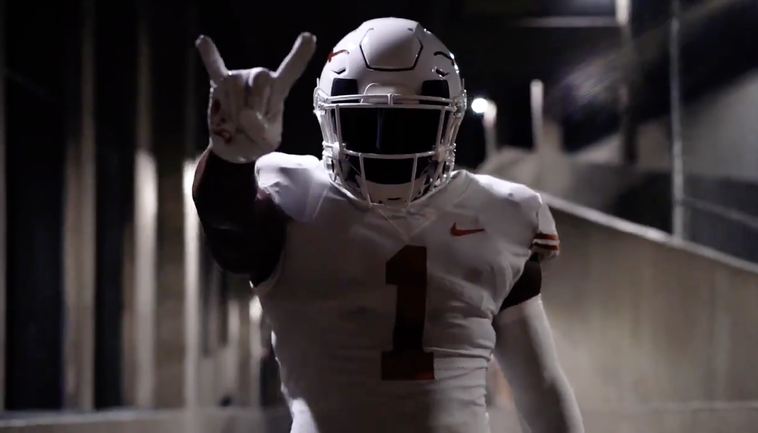
While the jersey changes were clearly the stars of the show with this update, some fans also noticed that the helmet clips above the facemask had been changed as well. The old clips sported a burnt orange Nike Swoosh set against a completely white base. In contrast, the updated clips feature Swooshes that are the same color as the dark orange helmet stickers, set against a white base with a black outline. This small change gives the helmet a more cohesive look, as it now features a uniform shade of burnt orange throughout.
Speaking of burnt orange, there has been some speculation that these new jerseys sport a darker shade of UT’s signature color. Many feel that the orange on Texas’ jerseys has gotten lighter over the course of the last 2 decades, with some fans citing images of jerseys from the early 2000s that clearly look darker. While we won’t know for sure if the shade of burnt orange has changed until these new uniforms hit the field, from the release photos they appear to be the same color as the game jerseys worn in the past few seasons. Additionally, recent Tweets from individuals associated with the athletic department seem to indicate that the shade of orange on these jerseys has not, nor has it ever changed.
Note: Various in-game pictures of UT’s uniforms seem to indicate that the jersey color has changed over the course of time. However, there are also images that show jerseys from different eras side-by-side, with each jersey featured possessing the same shade of orange as the next. These supposed differences in color could be due to changes in material fabric and stadium lights over the years. These factors, when paired with certain lighting conditions and levels of sweat, might explain why jerseys from various eras appear to be different colors, when in reality they have always been the same shade of Pantone 159 (this video does a great job of breaking down this potential phenomenon).

Author Opinion: The Best Uniform in College Football
When others ask me to rank the best uniforms in college football, I usually try to refrain from including UT’s set on my list. Given my fandom for the team and the obvious bias that comes with it, I’ve always felt that it would be impossible to evaluate them fairly when compared to other schools. While this still might be the case, I’m going to break my usual conventions on this subject, and boldly claim that with this updated set the Texas Longhorns have the best uniform in college football.
The updates to the jersey, though minor, have had an massive effect on the overall look of the uniform. By omitting some of the clutter found on the previous iteration, these new jerseys have a cleaner, more focused look to them. As such, the new shirt does a more effective job at conveying the things that make UT special: the unique burnt orange color and the school’s status as the flagship university of the Lone Star State. While these change were both a safe and an obvious move, I’m glad CDC and athletic department paid extra attention to the details to get them right.
When there were rumblings that the Longhorns might be going to the throwback look full time, I was torn on whether or not I would be ok with the potential change. While I do love UT’s vintage look, I’ve long appreciated the font “TEXAS” on the front of the chest. This design element has always made it feel like the Longhorns were representing not just the University, but also the entire state of Texas. Now that I’ve seen the final product, I’m glad we decided to keep the font a key part of the jersey. However, I do hope that UT will continue to wear throwback uniforms going forward, and that the school will perhaps opt to save them for big games (such as how Ohio State only wears their throwbacks for playoff matchups).

Conclusion
Overall, the powers that be did a great job of making small tweaks to UT’s jerseys that resulted in a big change to the uniform’s overall aesthetic. While the removal of TV numbers and the collar Longhorn might seem insignificant (if not outright non-existent) to some, fans who pay attention to the team’s uniforms will likely see these minor changes as a major improvement. Although the potentially unchanged shade of burnt orange might draw the ire of some, it’s likely that even they will see this update as a net positive, at least when compared to UT’s last jerseys.
What are your thoughts on the Longhorns’ new football uniforms? Do you appreciate the subtitle changes made, or were you hoping for a more extreme overall when compared to the previous set?


Add comment